Data visualization is quite often a struggle to represent multiple relevant dimensions preserving the readability of the plot. In this post I will show my recent multidimensional dataviz prepared for Rostock Retreat Visualization, an event that gathered demographers for an amazing “three days long coffebreak”.
European population is rapidly ageing. But the process is not happening uniformly in all parts of Europe (see my recent paper for more info). Regions differ quite a lot: Eastern Europe still undergoes demographic dividend; Southern European regions form a cluster of lowest-low fertility; Western Europe experiences the greying of the baby boomers; urban regions attract young professionals and force out young parents; peripheral rural regions lose their youths forever… How can we grasp all the differences at a glance?
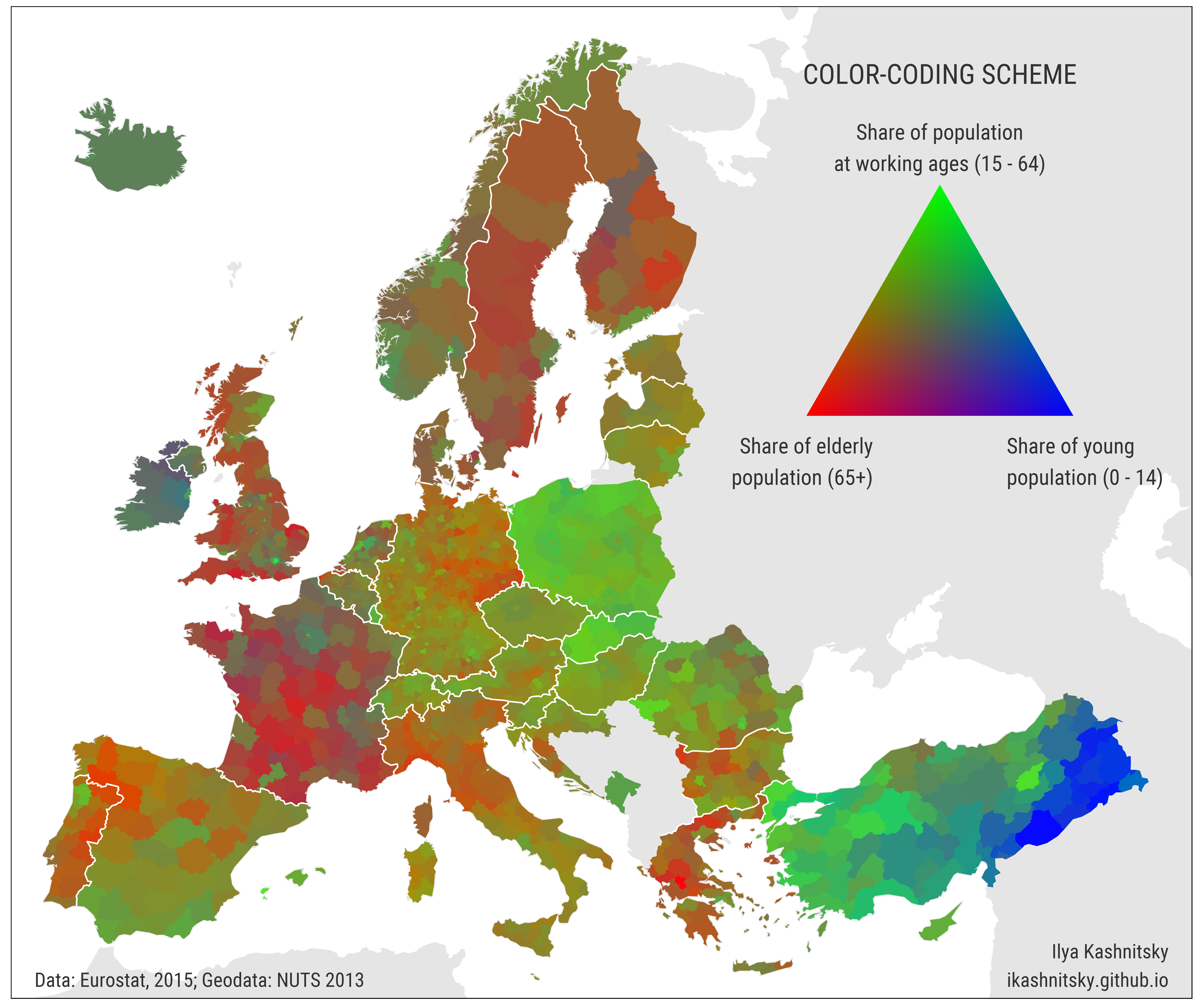
Here I want to present a colorcoded map. For each NUTS-3 region the unique color is produced by mixing red, green, and blue color spectrums in the proportions that reflect,correspondingly, relative shares of elderly populating (aged 65+), population at working ages (15-64), and kids (0-14).

Each of the three variables mapped here is scaled between 0 and 1: otherwise, the map would be just green with slightly variations in tones because the share of working age population is ranged between 65-75% for modern European regions. Thus, it is important to note that this map is not meant to be able to inform the reader of the exact population structure in a specific region. Rather, it provides a snapshot of all the regional population structures, facilitating comparisons between them. So, by design, the colors are only meaningful in comparison only for the given set of regions in a given year, in this case 2015. If we want cross-year comparisons, the variables are to be scaled across the whole timeseries, meaning that each separate map would, most likely, become less contrast.
In the map we can easily spot the major differences between subregions of Europe. Turkey is still having relatively high fertility, especially in the south-eastern Kurdish part, thus it has higher share of kids and it’s colored in blueish tones. The high-fertility Ireland is also evidently blue in the map. East-European regions are green due to the still lasting demographic dividend. Southern Europe is ageing fastest, thus the colors are reddish.
We can also see most of the major capital regions that are bright-green as opposed to the depleted periphery. In some countries there are huge regional differences: Northern and Southern Italy, Eastern and Western Germany.
It is striking how clearly can we see the borders between European countries: Poland and Germany, Czech Republic and Slovakia, Portugal and Spain, France and all the neighbors. The slowly evolving population structures bare imprints of unique populations’ histories, that largely correspond with state borders.
The obvious drawback of the map is that it is not colorblind friendly, and there is no way to make it so because color is the main player in this dataviz.