# load required packages
library(tidyverse) # version 1.0.0
library(HMDHFDplus) # version 1.1.8

country <- getHMDcountries()

exposures <- list()
for (i in 1: length(country)) {
        cnt <- country[i]
        exposures[[cnt]] <- readHMDweb(cnt, "Exposures_1x1",
                                       ik_user_hmd, ik_pass_hmd)

        # let's print the progress
        paste(i,'out of',length(country))
}Sex ratios reflect the two basic regularities of human demographics: 1) there are always more boys being born; 2) males experience higher mortality throughout their life-course. The sex ratio at birth does not vary dramatically1 and is more or less constant at the level of 105-106 boys per 100 girls. Hence, differences in the sex ratio profiles of countries mainly reflect gender gap in mortality. In this post I will compare sex ratios age profiles in all countries included in Human Mortality Database.
1 There are cases of big deviations from this natural constant. The most well known one is the skewed sex ratio in China, where decades of One Child Policy together with strong traditional son preference resulted in selective abortions. Read more: Frejka et al. (2010); Feng (2011); Basten and Verropoulou (2013).
R gives amazing opportunities to grab data fast and easy. Thanks to Tim Riffe’s HMDHFDplus package, one can now download HMD data with just a couple of lines of R code.
There is a handy function in HMDHFDplus package – getHMDcountries(). It lists the codes for all countries in HMD. So it becomes really easy to loop through the database and download data for all countries.
Please note, the arguments ik_user_hmd and ik_pass_hmd are my login credentials at the website of Human Mortality Database, which are stored locally at my computer. In order to access the data, one needs to create an account at www.mortality.org and provide his own credentials to the readHMDweb() function.
Next, I select 2012 for comparison – it is quite recent, and for most of the HMD countries there are data for 2012. The loop goes through each of the countries’ dataframe in exposures list, selects data for 2012 and calculates sex ratio at each age. I also remove data for several populations (like East and West Germany separately).
sr_age <- list()

for (i in 1:length(exposures)) {
        di <- exposures[[i]]
        sr_agei <- di |> select(Year,Age,Female,Male) |>
                filter(Year %in% 2012) |>
                select(-Year) |>
                transmute(country = names(exposures)[i],
                          age = Age, sr_age = Male / Female * 100)
        sr_age[[i]] <- sr_agei
}
sr_age <- bind_rows(sr_age)

# remove optional populations
sr_age <- sr_age |>
    filter(!country %in% c("FRACNP","DEUTE","DEUTW","GBRCENW","GBR_NP"))
After age 90, sex ratios become quite jerky due to the relatively small numbers of survivors. I decided to aggregate data after the age 90.
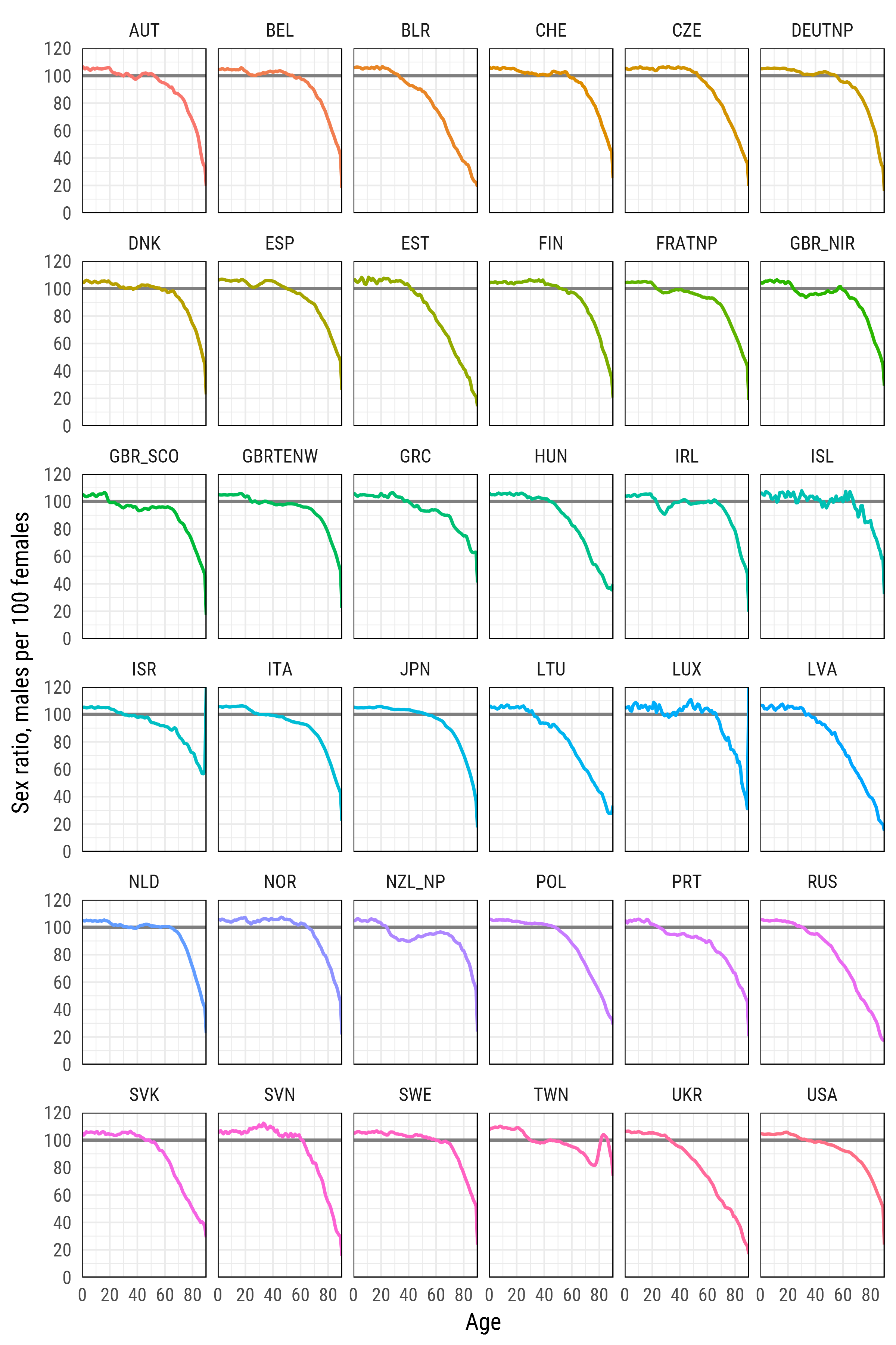
Finally, I plot the resulting sex ratios.
# get nice font
library(extrafont)
myfont <- "Roboto Condensed"

# finaly - plot
gg <- ggplot(df_plot, aes(age, sr_age, color = country, group = country))+
        geom_hline(yintercept = 100, color = 'grey50', size = 1)+
        geom_line(size = 1)+
        scale_y_continuous(
            limits = c(0, 120), expand = c(0, 0), breaks = seq(0, 120, 20)
        )+
        scale_x_continuous(
            limits = c(0, 90), expand = c(0, 0), breaks = seq(0, 80, 20)
        )+
        xlab('Age')+
        ylab('Sex ratio, males per 100 females')+
        facet_wrap(~country, ncol=6)+
        theme_minimal(base_family = myfont, base_size = 15)+
        theme(legend.position='none',
              panel.border = element_rect(size = .5, fill = NA))

gg
There is quite a variety in the sex ratio profiles. If the initial prevalence of males equalizes in Japan, Sweden, or Norway at around 60, in Russia, Belarus, and Ukraine this happens at around 30 due to very high male mortality. In many countries there are pronounced bumps in the sex ratio at ages 20-30, that are likely to be caused by international migration. For example, Scotland, Northern Ireland, Portugal, and New Zealand are experiencing substantial outflow of young men.
What happened in Taiwan?