Tiny things can separate life into “before” and “after”. Here is one. For almost a year I’ve been daily sending mental “thank you” to Ugo who showed me how to re-organize panes in RStudio. Since then I’ve been spreading this tiny improvement so many times that I thought the tiny advise deserved a separate tiny post. Please note, below is an opinionated view of a comfortable UI improvement; feel free to ignore it if you don’t like. This advise is highly subjective, though, I really believe it is useful.
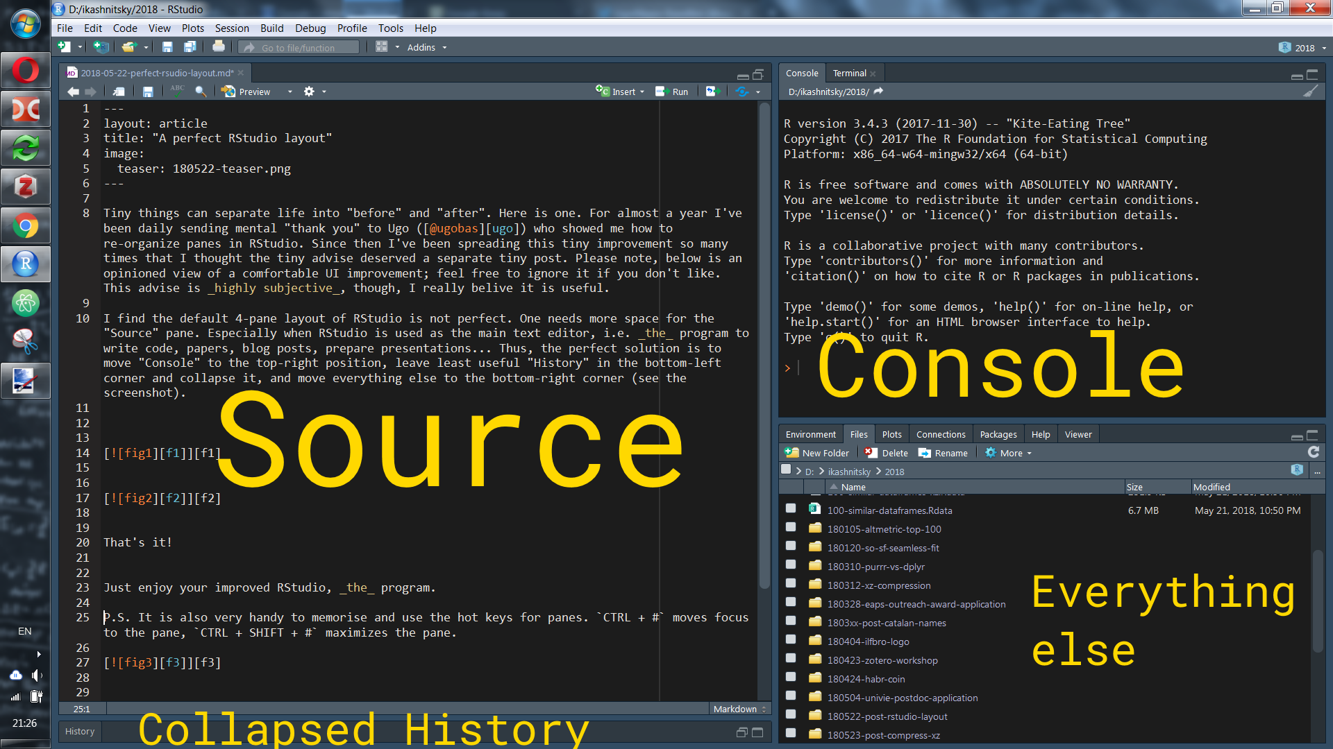
I find the default 4-pane layout of RStudio is not perfect. One needs more space for the “Source” pane. Especially when RStudio is used as the main text editor, i.e. the program to write code, papers, blog posts, prepare presentations… Thus, the perfect solution is to move “Console” to the top-right position, leave least useful “History” in the bottom-left corner and collapse it, and move everything else to the bottom-right corner (see the screenshot).

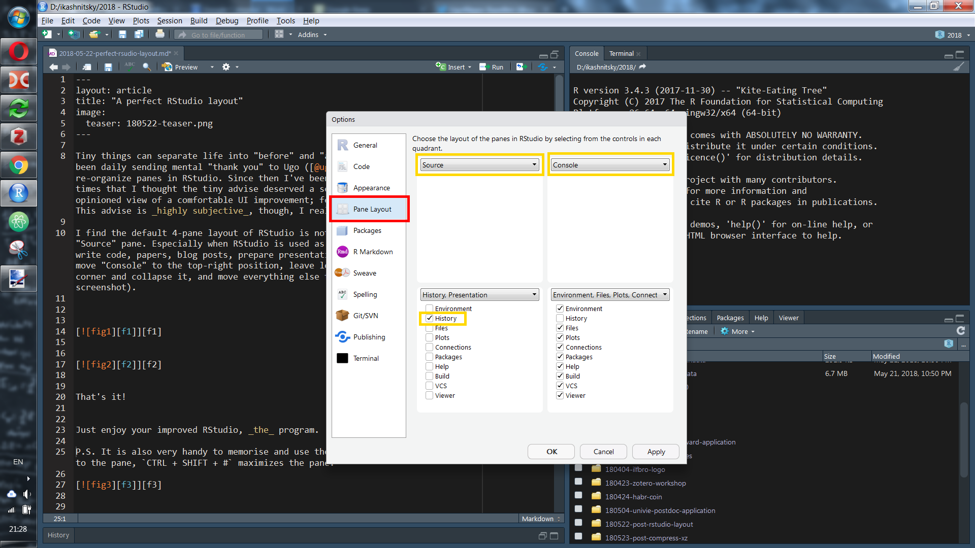
Just go to “Tools” –> “Global options” –> “Pane layout” and fix it.

That’s it!
Just enjoy your improved RStudio, the program.
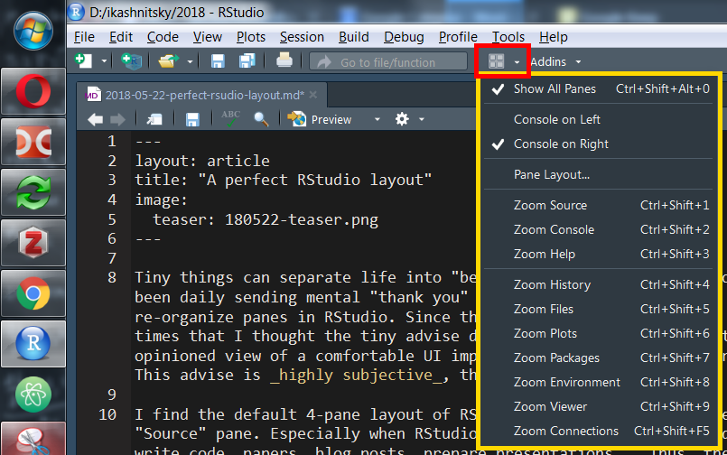
P.S. It is also very handy to memorize and use the hot keys for panes. CTRL + # moves focus to the pane, CTRL + SHIFT + # maximizes the pane.
