2026

UK monarchs' longevity against their people: a demographically correct reanalysis
Following the death of Prince Philip in April 2021, The Conversation published a piece by Jay Olshansky titled “Long live the monarchy! British royals tend to survive a full…
2025
Beyond Fraud: How IHME Distorts Academic Metrics
Recently, a post on LinkedIn highlighted a Google Scholar profile of an apparently just starting PhD researcher who suddenly started accumulating unbelievable counts of…

Sidekick projects may be worthy distractions for an early academic
In the last few days, I’ve been thinking a lot about Claus Wilke’s blog post on the essential need of writing and publishing a lot of papers for academic researchers. This…
2024
![[UPD] Zotero hacks: reliably setup unlimited storage for you personal academic library [UPD] Zotero hacks: reliably setup unlimited storage for you personal academic library](./2024/zotero7/zotero-teaser.png)
[UPD] Zotero hacks: reliably setup unlimited storage for you personal academic library
In summer 2024, Zotero had a major update to version 7. The update affected some of the setup routines that I outlined ages ago in the Zotero hacks post. The recipe laid out…
2023
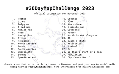
30DayMapChallenge my 25/30 contributions
For four years I’ve been following #30DayMapCallenge with admiration but not daring to commit to it. Producing maps was always an accompanying step in my main activities…
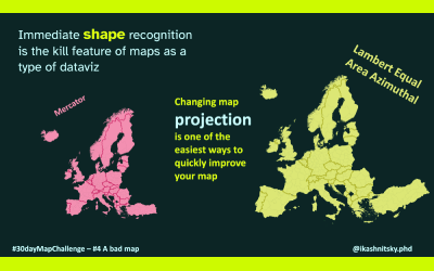
Improve your maps in one line of code changing map projections
Did you ever think why we (okay, I’m clearly biased, maybe just many of us, humans) love maps so much? Why do they often work so much better than other types of dataviz?
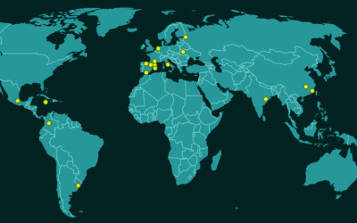
Geocode address text strings using `tidygeocoder`
Deriving coordinates from a string of text that represents a physical location on Earth is a common geo data processing task. A usual use case would be an address question…
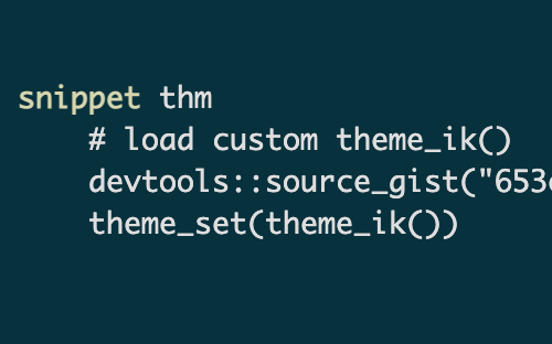
Easily re-using self-written functions: the power of gist + code snippet duo
Quite often data processing or analysis needs bring us to write own functions. Sometimes these self-defined functions are only meaningful and useful within a certain…
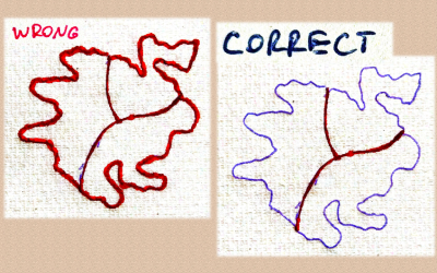
The easiest way to radically improve map aesthetics
Since R community developed brilliant tools to deal with spatial data, producing maps is no longer the privilege of a narrow group of people with very specific almost…
2022

Were there too many unlikely results at the FIFA World Cup 2022 in Qatar?
FIFA World Cup 2022 in Qatar saw many surprising results. In fact, too many – some would argue. From the unbelievable loss of Argentina to Saudi Arabia at the very beginning…
2021
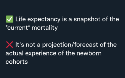
What is life expectancy? And, even more important, what it isn't
It really is a remarkable achievement and maybe a lot of luck that the world mundanely operates with such a complex indicator as life expectancy. Unlike many statistics and…
2020
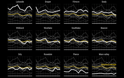
Show all data in the background of your faceted ggplot
One of the game-changing features of ggplot2 was the ease with which one can explore the dimensions of the data using small multiples.1 There is a small trick that I was to…
2019
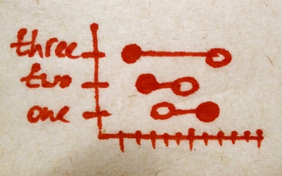
Dotplot – the single most useful yet largely neglected dataviz type
I have to confess that the core message of this post is not really a fresh saying. But if I was given a chance to deliver one dataviz advise to every (ha-ha-ha) listening…

Zotero hacks: unlimited synced storage and its smooth use with rmarkdown
Here is a bit refreshed translation of my 2015 blog post, initially published on Russian blog platform habr.com. The post shows how to organize a personal academic library…
See you in Barcelona this summer
Have you been feeling lately that you are missing out the coolest skill-set in academia?
2018

sjrdata: all SCImago Journal & Country Rank data, ready for R
SCImago Journal & Country Rank provides valuable estimates of academic journals’ prestige. The data is freely available at the project website and is distributed for deeper…
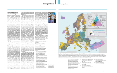
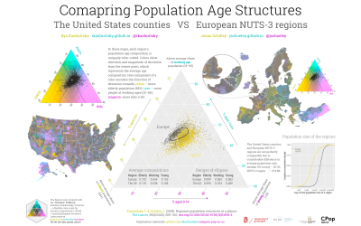
Regional population structures at a glance
I am happy to announce that our paper is published today in The Lancet.

Deep Catalan roots: playing with stringdist
This academic year I am participating in European Doctoral School of Demography. It is a unique one-year-long training for PhD students in demography. It keeps migrating…
2017

Young people neither in employment nor in education and training in Europe, 2000-2016
As an example of Eurostat data usage I chose to show the dynamics of NEET (Young people neither in employment nor in education and training) in European countries. The…
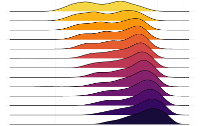
Global convergence in male life expectancy at birth
In the modern history, the world has seen unprecedented decrease in human mortality – the result of the Demographic Transition. Initially, the improvements occurred only in…
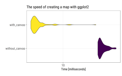
Accelerating ggplot2: use a canvas to speed up plots creation
Basically, this post turned out to be just a wrong, premature, and unnecessary attempt of code optimization. If you still want to have look, make sure that later you read thi…
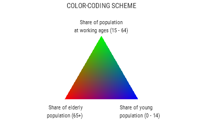
Colorcoded map: regional population structures at a glance
Data visualization is quite often a struggle to represent multiple relevant dimensions preserving the readability of the plot. In this post I will show my recent…

Evolution of ice hockey players' height: IIHF world championships 2001-2016
The 2017 Ice Hockey World Championship has started. Thus I want to share a small research on the height of ice hockey players that I did almost a year ago and published in…
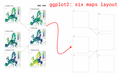
Arranging subplots with ggplot2
For my recently published paper, I produced not-so-standard figures that show the two step decomposition used in the analysis. Have a look:
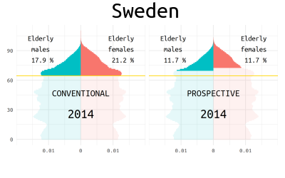
Who is old? Visualizing the concept of prospective ageing with animated population pyramids
This post is about illustrating the concept of prospective ageing, a relatively fresh approach in demography to refine our understanding of population ageing. This…
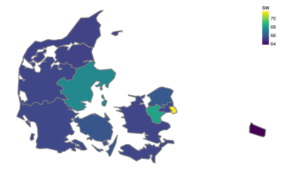
R, GIS, and fuzzyjoin to reconstruct demographic data for NUTS regions of Denmark
NUTS stands for the Nomenclature of Territorial Units For Statistics. The history of NUTS dates back to the beginning of 1970s, when European countries developed unified…
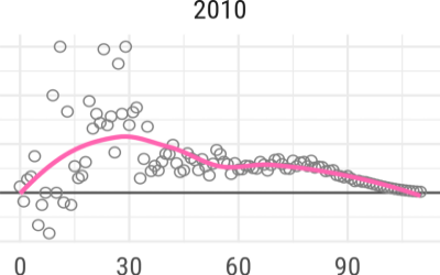
Gender gap in Swedish mortality
Sweden, with its high quality statistical record since 1748, is the natural choice for any demographic study that aims to cover population dynamics during a long period of…
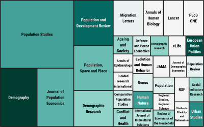
30 issues of Demographic Digest - the most frequent journals
This week, the 30-th issue of my Demographic Digest was published.
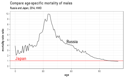
Male mortality in Russia and Japan
Russia is sadly notorious for its ridiculously high adult male mortality. According to Human Mortality Database data (2010), the probability for a Russian men to survive…
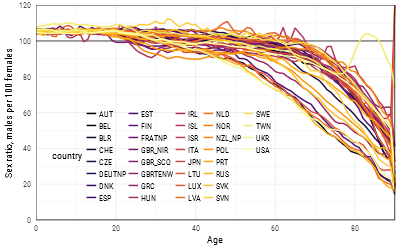
Sex ratios in all countries from Human Mortality Database
Sex ratios reflect the two basic regularities of human demographics: 1) there are always more boys being born; 2) males experience higher mortality throughout their…

